

My five favourite colours – part 2
Now for the remaining three colours in my favourite five.
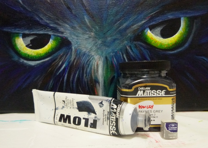
Paynes Grey
Now I’m not a huge fan of grey in general. Greys have their uses, but used incorrectly as they often are, they can be dull and boring. I also don’t tend to use black paint in my paintings. I will use black for stylistic choices, but not when compiling anything that is remotely realistic. Black pigments don’t work well in creating shadows and can suck the life out of a painting.
So I use Payne’s Grey…which isn’t really a grey, but a deep grey blue. It is dark enough to substitute for black, but has enough blue in it to react nicely within the colour wheel and play nicely with all the other colours (which black does not).

Here you can see one of my earliest paintings where I used Payne’s grey as a solid underpainting…and, oh dear, there is that cadmium orange at work again.

The Letter, acrylic on canvas, approx. 610 x 510mm. SOLD
The underpainting had a very strong effect on the whole of this painting. It gave it a very dark undertone that was very interesting. You can find all the work-in-progress shots for this painting on my blog.
Payne’s Grey is a mixture of pigments. According to my go to colour book, Artist’s Color Manual: the complete guide to working with color, by Simon Jennings (highly recommended, I love this book), and Wikipedia, traditional Payne’s Grey is a mixture of blues, crimsons and yellows/ochres. My stash of Matisse versions goes with the modern version of Ultramarine (PB29) and Mars Black (PBk 11), so I’ve learnt today that yes, I do use black in my paintings ::headdesk:: ignore my waffle above.
Payne’s Grey is reportedly named after William Payne, a late 17th century watercolourist.
Deep Rose Madder
This is a dark red of the alizarin group. I like this colour simply for its colour. I use it, but not like Payne’s grey or cadmium orange, I just love its deep red colour. I wrote a post a while back on Alizarin talking about its origins, from plant to synthetic pignment. You can find all my posts on colour on my blog, many of which discuss pigment origins (it is fascinating) and how some colours work to create others. In my post on Alizarin I mentioned that I didn’t have the pigment information on Golden’s version of Rose Madder, Alizarin Crimson Hue – well, apparently I can’t read a label. Golden uses Quinacridone Magenta, Quinacridone Burnt Orange and, would you believe it, Phthalo Green (Blue shade) to create this colour. I’ve used green in combination with reds to create flesh colours before, so I guess this is the same principle of creating shades with opposing colours.

This colour is also extremely transparent, which makes it fantastic for some uses, particularly when mixed with acrylic mediums. the above was self-leveling gel and a little titanium white…and a toothpick.

Indanthrene / Indanthrone / Athraquinone Blue, or more simply Indigo
This deep warm blue is expensive (but then, so is Deep Rose Madder above), but it has some unique properties which other blues can not compensate. I bought it as a late addition to my palette and while in a penny pincher moment (it varies on how much I want something, what time of the year, how I’m feeling…the scale goes from ‘I’m not spending that!’ to ‘Have all my money and give me gorgeous art materials!’) so the price stuck in my head. Consequently it is a fairly new but addictive colour…that now I can’t live without (my credit card hates me).

I used it in my paint markers while doing my stamping recently. It makes a great outliner and strong blue. And when I first bought it, I loved it so much, I did this below.

Golden calls it Athraquinone Blue, Matisse likes to make it personal and calls it Matisse Indigo, but they both use PB60 pigment – Indathrone Blue. As to the many long and complicated names – chemistry is to blame. Indathrone (also called Indathrene) is made from an Athraquinone – the explanation of which hurts my brain and reminds me that my skill set lies in art, not chemistry.
Like Rose Madder, this is a colour I just like for the colour. I haven’t used it extensively, it is not a core component of any of my paintings, but it is lovely nonetheless.

So there are my five favourite colours. Well, paint colours. And somehow I went nowhere near green – maybe because foliage just gets me down. I love painting flowers and foliage is necessary, but I get bored 😀 I love green. The interior of my house is mostly green along with some serious parts of the exterior, and I use lots of it in my painting, but when it comes to listing favourites, it just doesn’t seem to be up there any more 🙁
I should also note that none of the above is the most used paint in my palette. That honour belongs to the wonderful and indispensable Titanium White. Where would I be without this mandatory colour? It is highly unshouted and sits quietly in the cheapest series of paints, but which none of my paintings can do with out. So if I was to be fair, White should be in this list, but it isn’t. ‘Cause I ain’t fair, and these colours be so pretty, ‘specially when I adds white to ’em!
This is my submission for Willy Nilly Friday Five and Five on Friday this week. I know there is only three this week and two last week, but colour is a very involving subject 😀 I’ll try to do better next week 😀
Art Always!
Best wishes,
Liz

Wow, some aesthetically nice colours to look at! And the picture ‘The Letter’ is great! No wonder it sold! :0) Love the Indigo and the Deep Rose Madden. Unusual colours
Thanks, KJ. I’ve been reading your last post about plane trips with kids – I got interrupted and haven’t finished it yet – you have some fabulous tips in there. I will get back to it asap.
Thanks so much for dropping by and for your kind comments.
Best wishes,
Liz
Oh yes! First let me tell you that the painting The Letter is exquisite! And I love Payne’s Grey myself to use instead of black…boy am I anxious to get back to my oils! Deep rose madder of course is a sure favorite as well. And I love cobalt blue which is right next to indigo! Wonderful post, as always!
Yes, cobalt blue! Another favourite colour like indigo and rose madder, adore it, but don’t have a set use for it.
I’ve never really used oils much. I pretty much decided that I was equipped for acrylics so I’d stick with that – too expensive otherwise. And I’m impatient – waiting for them to dry would be a pain 😀
Thanks so much for dropping by and for your kind comments.
Best wishes,
Liz
A unique but very interesting variety of photos!
Interesting post, love hearing / reading – you discuss colour. I don’t paint or draw but fascinating none the less. I like green, always have loved the colour. My poor Mum, I had most of my clothes in green, dress, skirt even a pair of jeans. I do like other colours now, red and turquoise. So pleased to be able to enjoy colour, a colourful world indeed. Have a good week, Cathy x